

I've played around with making a blog background probably since the first month I started this blog a little over a year ago. Never with much success. And I'm not saying that I'm going to STICK with what I've got at this moment either- buuuut, I do admit to liking it the best so far. I've learned some things. And putting them into practice has made me much more satisfied with my work. But I also recognize that there is something...hmmmm...I dunno...missing maybe. But with this simple how to- you can start playing around with backgrounds on your own and probably make something even better.
Now, the other week, I ran across this pin:
And reading over this whole post by Angela at a Typical English Home is worth it. She has other tutorials as well. Pretty much I went through her whole list of top ten, and tried them for myself. Clearly- I did not go with the whole "less is more idea". I can't help it- I like patterns. Still though- the first gem from this post was her suggestion of getting a color scheme from Design Seeds. I had found this site earlier in the year when I was thinking about getting a house and painting the walls- that dream has been shelved a the moment, but I will be picking that back up next Spring. So anyway- I loaded up the site and joy of joys! Miracle of miracles! This was the palette of the moment:

Completely perfect for me as the last three colors to the right are my color scheme for my classroom! And now, already done for me are my accent colors. Perfection!
Even if you don't want to design a blog background- Design Seeds is a completely fun site to look at if you're into color combinations.
Ok- the next place to visit is this blog tutorial by The Cutest Blog on the Block:

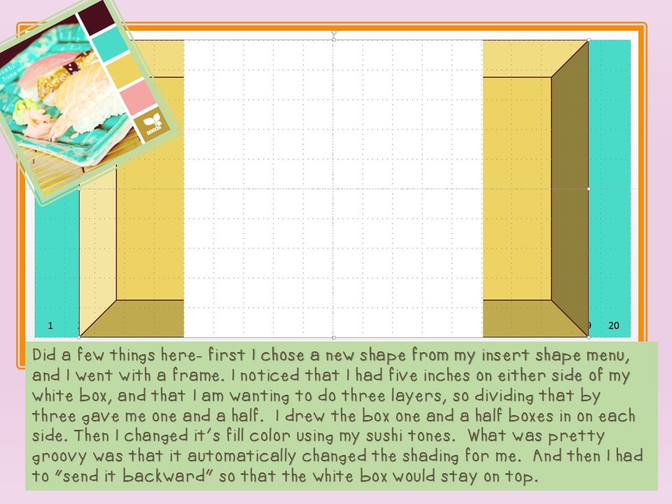
The last blog background I made I used this tutorial and their html code. But when I tried it again the other day, I couldn't get the code to work. I'm pretty sure that's an error on my part- but it did make me discover how to do this same idea on Power Point. The best tidbit of information they have on here is that the blog background dimensions should be 20 X 10.

And then go ahead and pick your the color you want the main background of your blog to be.

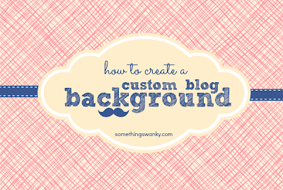
Ok, at this point, I began to blend approaches and I used some design ideas from this blog background tutorial by Ashton at Something Swanky:

Save this background just as you have it right now as a JPEG and make sure you put it where you can find it- now we're going to go back to blogger to the design area.


Alright, now Ashton's tutorial shows you how to use this information to add in your layers. You look at the numbers on your blog background to help you determine where to put the next layers. I won't repeat all that she said, as she did such a great job at it in the first place. But I'll show you how I had some fun:

Each time I add an element, I resave as a JPG and upload it again to the blog to check to see it looks alright.
Almost there...


I realize it's not full of bells and whistles, but it does go to show what you can do with just power point and no clipart. Add a flower or two to a corner, and it'll look even better. Or maybe even a piece of sushi!
Keep in mind that Blogger wants a picture under 300K as a background. My blog background right now was only 130K- to put that in perspective. So you can add lots of elements- just keep an eye on that final number. I just saved the one above to see what it came in at- and the computer says 108. So lots and lots of room to add in fun stuff.
So what do you think? Is that something you think you could do? If you give it a try, let me know.
And in other creation news- Traci and I just finished our first pack of Shakespeare clipart:

I think he's super cute. He's based on a puppet she made me years ago. I'm going to use him in some of my writer's workshop lessons this year.
Design on, my friends!

Cute Button! te-hehe
ReplyDeleteOh, I'm working on some new fonts! One of them is my new fav.
Deniece